VerticalNeon is a contemporary original composition by japandi.art. It is not a historical print, but a modern typographic graphic that crosses NeonPunk energy with Japanese reading direction. The words NEON PUNK run top to bottom, applying the vertical orientation of traditional Japanese writing to Latin-script type. Hand-styled LOVE tags sit in the corners, and the whole field is washed in a violet-to-pink gradient. The result is a hybrid: contemporary graphic design built on a Japanese typographic habit.
The technique is type and gradient. The vertical NEON PUNK lettering is set with mechanical precision, while the corner LOVE tags are hand-styled and loose — a graphic tag in the tradition of Japanese street art and sticker culture. The background shifts from deep violet at the base to warm pink at the top, mirroring the way ambient neon light bleeds upward into a night sky. There is no image beyond the type and the colour field.
In a room, the print brings c . . . Read More >>
VerticalNeon is a contemporary original composition by japandi.art. It is not a historical print, but a modern typographic graphic that crosses NeonPunk energy with Japanese reading direction. The words NEON PUNK run top to bottom, applying the vertical orientation of traditional Japanese writing to Latin-script type. Hand-styled LOVE tags sit in the corners, and the whole field is washed in a violet-to-pink gradient. The result is a hybrid: contemporary graphic design built on a Japanese typographic habit.
The technique is type and gradient. The vertical NEON PUNK lettering is set with mechanical precision, while the corner LOVE tags are hand-styled and loose — a graphic tag in the tradition of Japanese street art and sticker culture. The background shifts from deep violet at the base to warm pink at the top, mirroring the way ambient neon light bleeds upward into a night sky. There is no image beyond the type and the colour field.
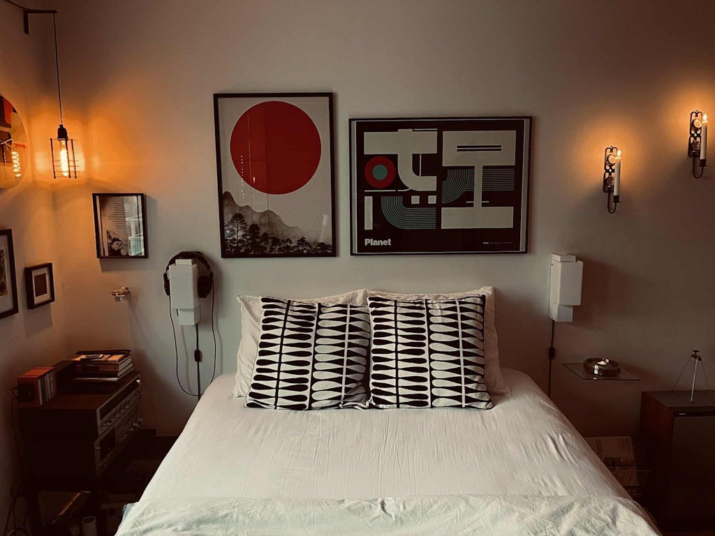
In a room, the print brings colour and motion to the wall. It suits home offices, creative studios, music rooms, and contemporary bedrooms where a strong colour note is welcome. The pink-violet palette settles more easily into warm rooms than the harder monochrome graphics in the same family.
Each edition is made to order. Choose an unframed fine-art paper print, a framed print behind shatter-resistant acrylic, or a satin-coated cotton canvas. The gradient holds its depth across all three.
Frequently asked questions
Why is the text arranged vertically in this composition?
Vertical text is a fundamental feature of traditional Japanese writing, where text runs top to bottom. This composition applies that reading direction to Latin-script type, creating a hybrid of contemporary graphic design and Japanese typographic tradition.
What does the word LOVE in the corners contribute?
The hand-styled LOVE text in each corner introduces informal energy that counterpoints the mechanical precision of the vertical NEON PUNK lettering — a graphic tag in the tradition of Japanese street art and sticker culture.
What does the colour gradient represent?
The shift from deep violet at the base to warm pink at the top mirrors the colour progression of ambient neon light bleeding upward into a night sky.
In what kind of room does this print work well?
Home offices, creative studios, music rooms, and contemporary bedrooms where a strong colour note is welcome. The pink-violet palette adapts better to warmer rooms than the harder monochrome prints.
<< Read Less
#Abstract
•
#Blue
•
#Contemporary Graphic Design
•
#Digital Art
•
#Electronic Music
•
#Gradient
•
#Graphic Design
•
#Love
•
#Modern
•
#Modern Graphic Design
•
#Neon
•
#Neon Aesthetic
•
#Neon Punk
•
#Neon-Punk Pink
•
#Punk
•
#Purple
•
#Typography