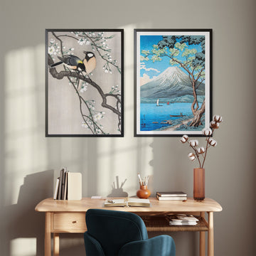


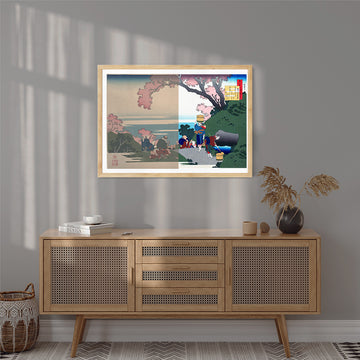
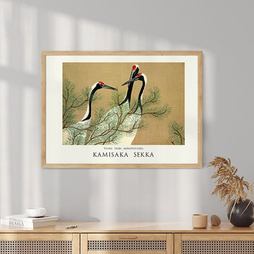
Produit magnifique conforme à mes attentes. Livraison rapide et emballage soigné.
Je recommande.
Merci infiniment
Beautiful art work - very happy with the quality
Schön
Perfect! Exactly like how I think it was!
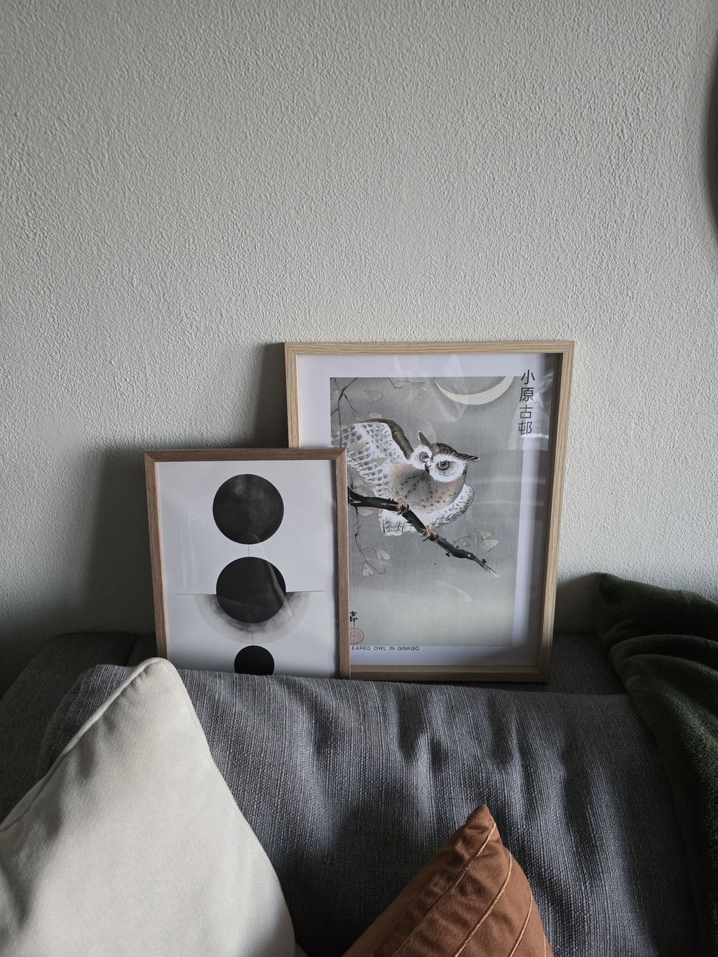
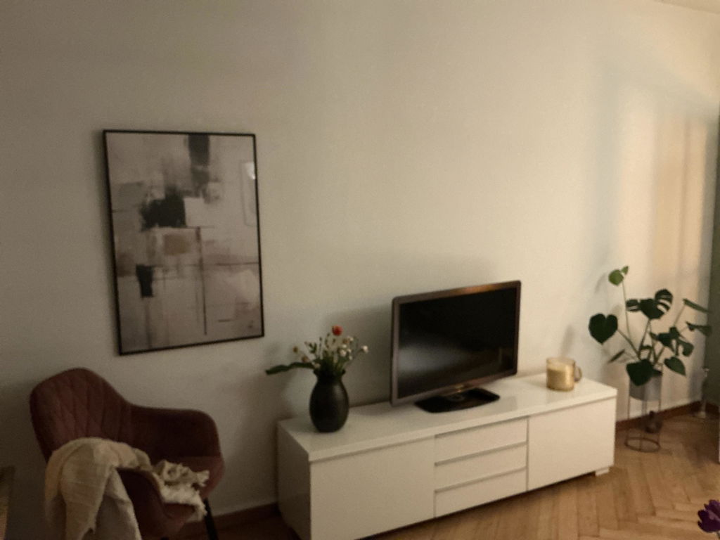
Well-balanced and executed work, quite discreet but eye-catching.
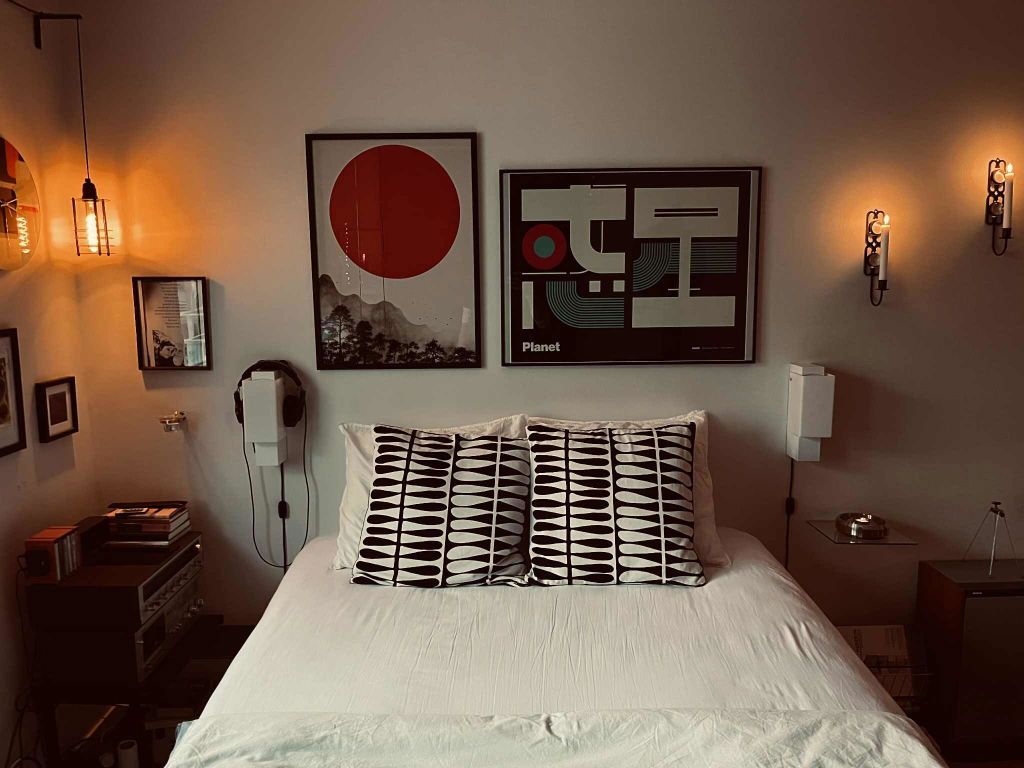
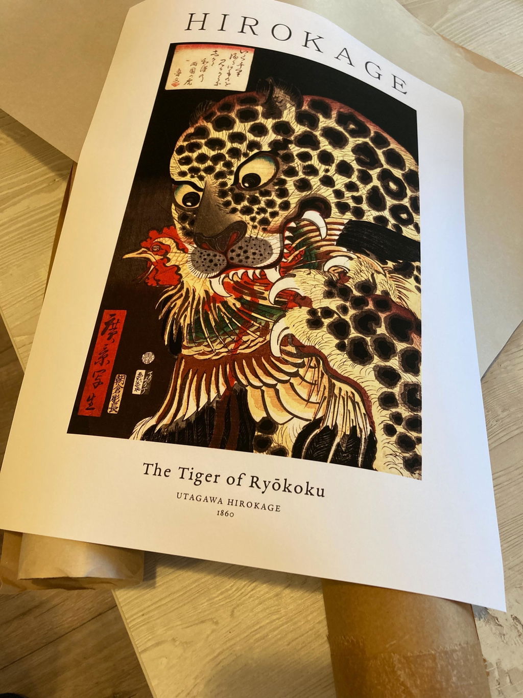
Leider ist der Druck nicht so intensiv...
preciosa🤩
Lamina enmarcada. Enamorada!
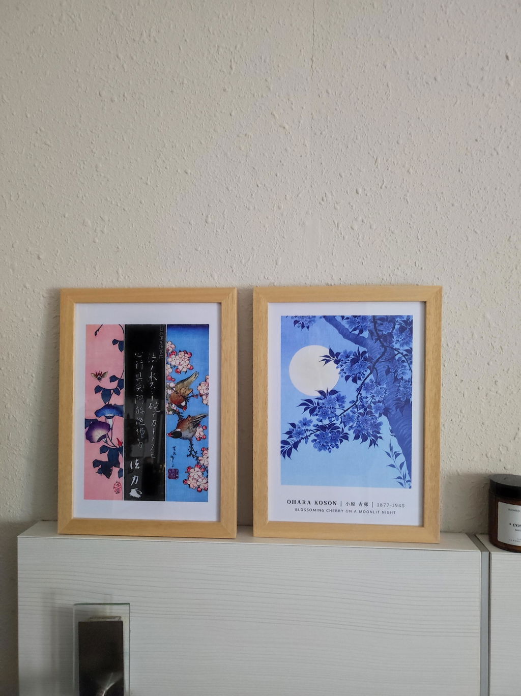
La lámina enmarcada es preciosa. La calidad de los materiales es excelente. Enamorada!
La atención al cliente también es genial, contacté por un duda y recibí una respuesta rápida.
Gracias!
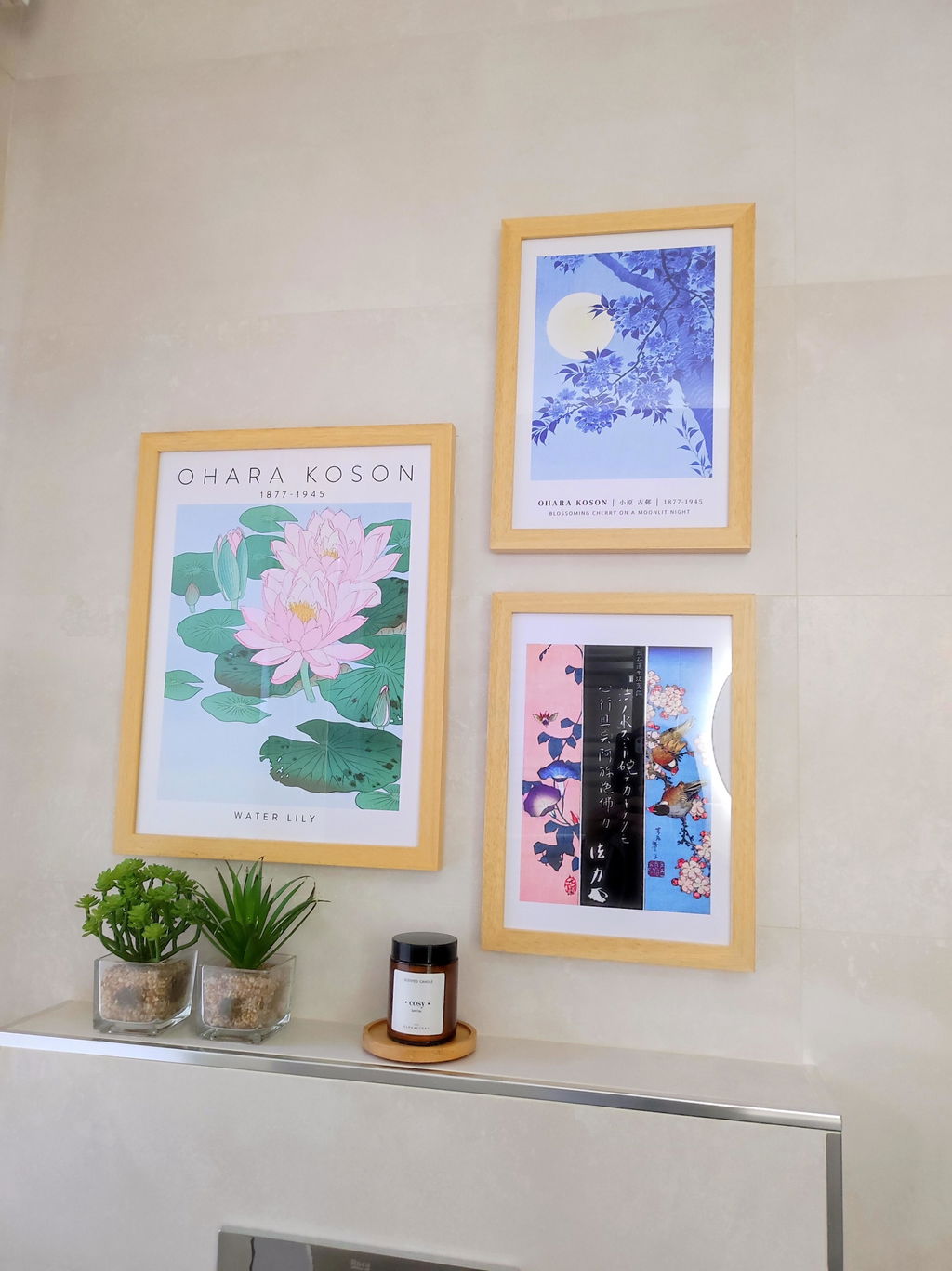
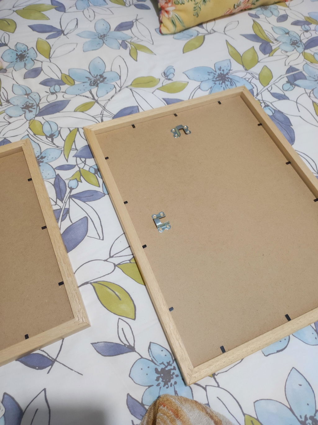
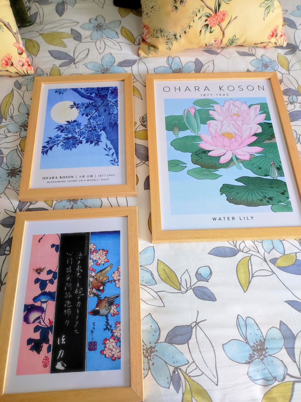
Das Bild kam schnell und super verpackt an, die Druckqualität ist hervorragend, der Holzrahmen ist völlig okay. Gerne wieder
Die vier Ecken (ursprüngliche Schnittkanten?) sind tatsächlich auf dem Druck. Stören jetzt nicht sehr, hatte ich allerdings nicht erwartet. Versand und Verpackung waren super!
Sehr zügige Bearbeitung der Bestellung und schöne Ausführung mit Rahmung.
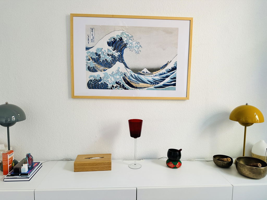
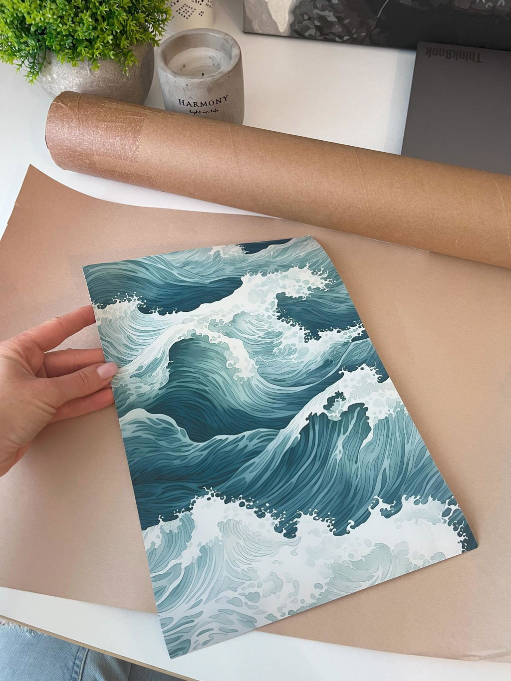
The order went extremely smoothly. The package arrived very quickly. The poster was very well packaged in a thick cardboard cylinder, so I received it without any damage. I especially like that they made sure the packaging contained minimal plastic! The print is of excellent quality, with saturated colors. I received a truly beautiful print. I will definitely order again!
I really like the picure, the blacks are soo deep and the red is so vivid, the scene is just filled with life.