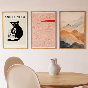
At its core, this print is about the pleasure of an uninterrupted line. The composition is built from flowing, organic curves — meandering forms that suggest the path of water through a landscape without depicting any specific river or place. The lines expand and contract, occasionally bunching and then separating again, their rhythm slow enough to read as calm movement rather than turbulence. The piece has no single focal point; the eye enters and follows.
The technique is digital, working in a vocabulary of clean, variable-weight curves on a neutral ground. This linearity connects to a long tradition of East Asian brush-line drawing — where the energy of a single continuous stroke carries as much meaning as the shape it describes — reinterpreted through contemporary graphic tools that allow for precise control of weight and spacing.
In a room, this print functions as visual quiet. The absence of colour saturation — working in near-monochrome with only minimal to . . . Read More >>
At its core, this print is about the pleasure of an uninterrupted line. The composition is built from flowing, organic curves — meandering forms that suggest the path of water through a landscape without depicting any specific river or place. The lines expand and contract, occasionally bunching and then separating again, their rhythm slow enough to read as calm movement rather than turbulence. The piece has no single focal point; the eye enters and follows.
The technique is digital, working in a vocabulary of clean, variable-weight curves on a neutral ground. This linearity connects to a long tradition of East Asian brush-line drawing — where the energy of a single continuous stroke carries as much meaning as the shape it describes — reinterpreted through contemporary graphic tools that allow for precise control of weight and spacing.
In a room, this print functions as visual quiet. The absence of colour saturation — working in near-monochrome with only minimal tonal variation — allows it to recede into a wall while still offering something to look at. It is the kind of print that changes slightly depending on the light and the time of day.
Available as a fine-art paper print, as a framed print with shatter-resistant acrylic, or as a gallery-style canvas. Printed on archival-quality materials.
Frequently asked questions
What visual tradition do these flowing lines connect to?
The compositional language owes a debt to East Asian brush-line traditions — where a single, continuous, rhythmically varied line describes space and movement without resorting to shading or perspective. This approach to line as the primary carrier of meaning is central to Japanese ink painting (sumi-e) and Chinese landscape scroll painting alike.
Is there a specific river or landscape depicted?
No specific river or place is referenced. The forms are abstract — they suggest the visual logic of flowing water (branching, narrowing, pooling) without mapping any real geography. This abstraction allows the viewer to bring their own associations to the composition.
What colours are used in this print?
The palette is near-monochrome — dark lines on a light neutral ground with minimal tonal variation. The restraint keeps the focus entirely on line quality and movement, and makes the print highly versatile as a wall piece in coloured rooms where a quieter anchor is needed.
Where does this print work best in a home?
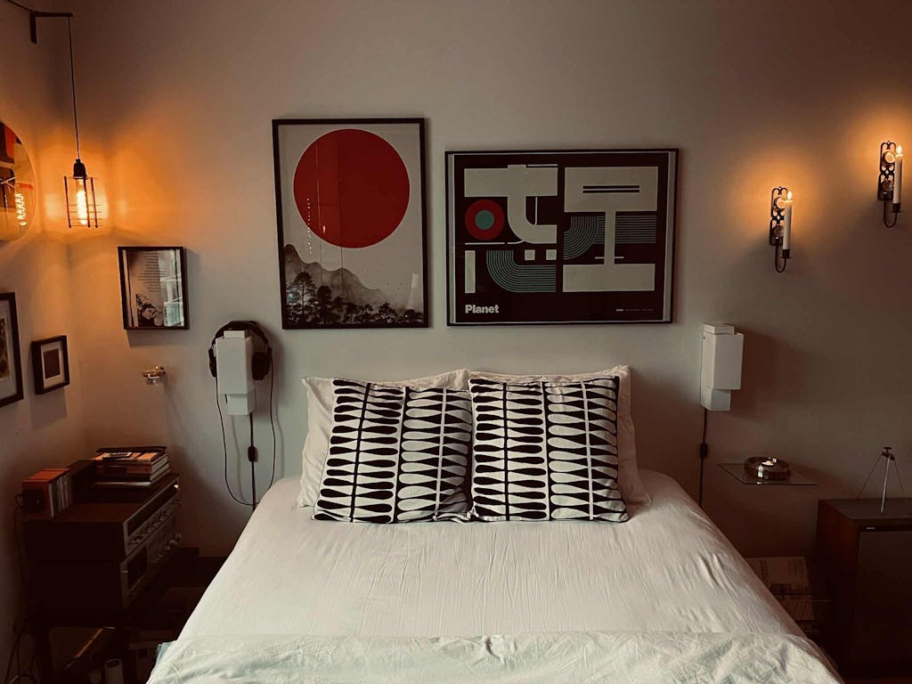
Its quiet, flowing character suits bedrooms, reading rooms, and spaces designed for low stimulation — home offices, yoga or meditation rooms, and minimalist living rooms where the print functions as visual texture rather than a dominant focal point.
<< Read Less
#Abstract
•
#Abstract Minimalism
•
#Abstract Modern Graphic
•
#Black
•
#Contrast
•
#Fluid
•
#Fluid Art
•
#Geometric
•
#Minimal
•
#Minimalist
•
#Modern
•
#Modern Abstract
•
#Modern Art
•
#Mustard
•
#Organic
•
#Waves
•
#White
•
#Yellow