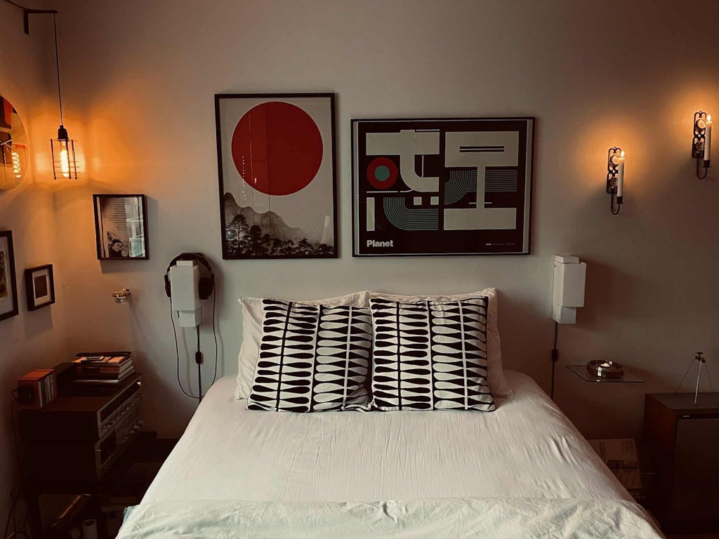
A field of rectangular forms fills this composition in tight, even rows, each block carried in a slightly different density of dry-brushed ink — so that what reads from a distance as a flat grid resolves up close into a surface of accumulated texture. The palette stays entirely in the monochrome range — black ink, grey midtones, the warm off-white of the paper ground — but within that range the eye finds considerable variation: some blocks are dense and opaque, others barely touched, creating a quiet breathing across what might have been a mechanical surface.
This contemporary studio work in the Japandi minimalist tradition applies the logic of careful mark-making to a geometric rather than organic subject. The hand is present throughout — in the slight irregularities at the edges of each block, in the variation of ink density from stroke to stroke — setting the composition apart from the uniformity of digital geometry. Printed on acid-free art paper, the composition's . . . Read More >>
A field of rectangular forms fills this composition in tight, even rows, each block carried in a slightly different density of dry-brushed ink — so that what reads from a distance as a flat grid resolves up close into a surface of accumulated texture. The palette stays entirely in the monochrome range — black ink, grey midtones, the warm off-white of the paper ground — but within that range the eye finds considerable variation: some blocks are dense and opaque, others barely touched, creating a quiet breathing across what might have been a mechanical surface.
This contemporary studio work in the Japandi minimalist tradition applies the logic of careful mark-making to a geometric rather than organic subject. The hand is present throughout — in the slight irregularities at the edges of each block, in the variation of ink density from stroke to stroke — setting the composition apart from the uniformity of digital geometry. Printed on acid-free art paper, the composition's tonal range is preserved at every print size.
The work performs well in rooms where it is viewed from a distance: from across a living or dining room the grid resolves into a quiet rhythm; up close the textural variation of the individual marks becomes visible. This layered reading — pattern from afar, surface texture up close — is characteristic of ink-on-paper work and rewards sustained looking.
Available as an art print on acid-free paper, as a framed print behind shatter-resistant acrylic, or as a satin-coated cotton canvas on a solid wooden frame, ready to hang.
Frequently asked questions
What makes this a Japandi work when it is geometric rather than figurative?
Japandi design is not defined by subject matter but by restraint, material honesty and the presence of the hand. This composition shows all three — a deliberately limited palette, the visible variation of brush-applied ink, and a structure that uses the ground as part of the rhythm.
Are the blocks perfectly regular?
No — each block is brushed by hand, so there are slight variations in ink density, edge quality and weight across the grid. What looks from a distance like a mechanical grid reveals a handmade surface up close.
What kind of room suits this work?
The composition is neutral and structured, and suits a wide range of rooms. Living rooms and home offices benefit from its quiet order; a dining room or hallway with a long view emphasises the grid rhythm. It harmonises well with contemporary Japandi, Scandinavian and minimal interiors.
Which formats are available?
Available in several standard sizes in three formats: art print, framed art print and canvas print. All options are listed on the product page.
<< Read Less
#Abstract
•
#Abstract Minimalist
•
#Geometric
•
#Geometric Abstract
•
#Minimal
•
#Minimalist
•
#Textured