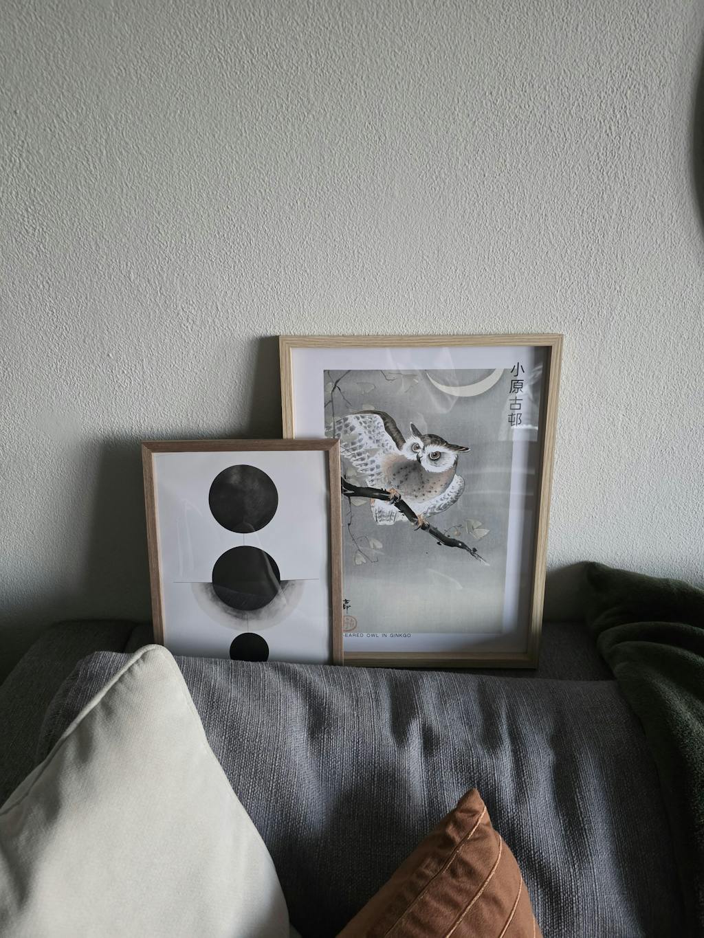
The layering of warm tones — amber, terracotta, the fading blush at the edge of a sunset — has been a recurring subject in Japanese art for centuries, from the glowing horizons of ukiyo-e to the graded skies of Hiroshige. This print distils that attention to warm atmospheric light into a sequence of stacked semicircles, each in a slightly different tone, the whole suggesting a slow passage from one state to the next.
The forms are rendered with an aged surface quality that lightly interrupts the edges and gives the composition a mature, considered character. The warm tones are layered in a sequence that runs from one end of the palette to the other — an arrangement that rewards from across the room as much as up close.
It brings warmth to rooms that might otherwise read cool or neutral. It sits naturally with natural wood, terracotta vessels, aged linen, and rattan — materials that carry the same quiet warmth as the print itself. It works both as a single focal pi . . . Read More >>
The layering of warm tones — amber, terracotta, the fading blush at the edge of a sunset — has been a recurring subject in Japanese art for centuries, from the glowing horizons of ukiyo-e to the graded skies of Hiroshige. This print distils that attention to warm atmospheric light into a sequence of stacked semicircles, each in a slightly different tone, the whole suggesting a slow passage from one state to the next.
The forms are rendered with an aged surface quality that lightly interrupts the edges and gives the composition a mature, considered character. The warm tones are layered in a sequence that runs from one end of the palette to the other — an arrangement that rewards from across the room as much as up close.
It brings warmth to rooms that might otherwise read cool or neutral. It sits naturally with natural wood, terracotta vessels, aged linen, and rattan — materials that carry the same quiet warmth as the print itself. It works both as a single focal piece and in curated groupings with other warm-palette works.
Available on archival fine art paper and on canvas. The aged texture carries especially well on canvas, where the surface of the medium adds a physical dimension that complements the quality of the composition.
Frequently asked questions
What gives this print its aged, weathered quality?
The composition uses a technique that interrupts the smooth edges of each semicircle with a textured surface, so the forms read as lightly worn — closer to something found than something newly made, which suits the warm, natural palette.
Are the warm tones preserved in print?
Yes. The amber, terracotta, and blush tones are reproduced with archival pigment inks calibrated to hold warmth and avoid the cooler cast that can sometimes appear in digital reproduction. The tones read consistently on paper and canvas.
Which interior styles suit this print best?
The print sits naturally with Japandi, wabi-sabi, and warm Scandinavian interiors — rooms that favour natural materials, muted warmth, and a considered approach to decor. It also bridges to warmer Mediterranean-influenced interiors.
Are the semicircles arranged top to bottom in a column?
The composition stacks the semicircles vertically, each tinted slightly differently from the one above, so a layered progression emerges — closer to a gradient than a repeated pattern, so the eye travels through the work rather than resting on a single form.
<< Read Less
#Abstract
•
#Abstract Illustration
•
#Abstract Minimalist
•
#Geometric
•
#Geometric Minimalist
•
#Illustration
•
#Minimal
•
#Minimalist
•
#Modern