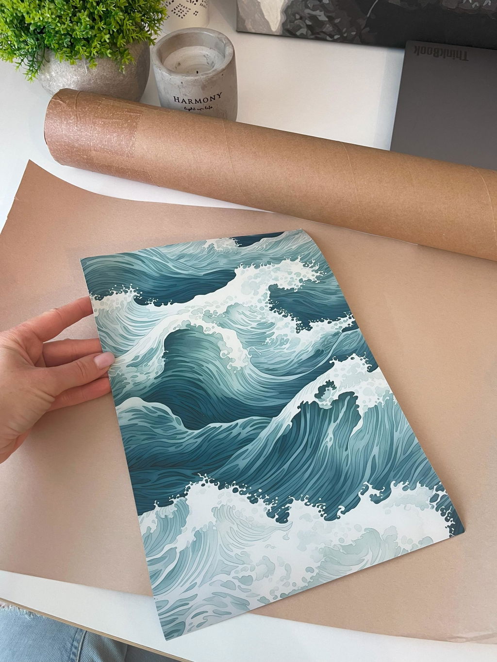
A calm river bend reads across the page in soft horizontal bands. The water moves without hurry, its edges blurred where one tone gives way to the next. There is no shoreline detail, no sky to anchor it — only the slow turn of tidal water held in muted blues and grey-greens. The mood is still and contemplative, an abstract distilled to current and light.
The work is built in watercolour, and the technique shows in every band. Pigment is laid wet so the tones bleed and pool, then settle into the graded washes that give the piece its depth. This soft tonal gradation draws on the East Asian ink-and-wash tradition and its bokashi shading, where colour fades by degrees rather than by line. The result is contemporary in idiom yet rooted in a long lineage of water painting.
In a room, the poster keeps to itself. Its restrained palette and flowing horizontals suit a japandi or minimalist interior, sitting well above a bed, a low bench, or a reading chair. The sof . . . Read More >>
A calm river bend reads across the page in soft horizontal bands. The water moves without hurry, its edges blurred where one tone gives way to the next. There is no shoreline detail, no sky to anchor it — only the slow turn of tidal water held in muted blues and grey-greens. The mood is still and contemplative, an abstract distilled to current and light.
The work is built in watercolour, and the technique shows in every band. Pigment is laid wet so the tones bleed and pool, then settle into the graded washes that give the piece its depth. This soft tonal gradation draws on the East Asian ink-and-wash tradition and its bokashi shading, where colour fades by degrees rather than by line. The result is contemporary in idiom yet rooted in a long lineage of water painting.
In a room, the poster keeps to itself. Its restrained palette and flowing horizontals suit a japandi or minimalist interior, sitting well above a bed, a low bench, or a reading chair. The soft blues cool a space without dominating it, and the abstract subject leaves room for the eye to rest. It pairs easily with natural wood, linen, and pale walls.
Choose the format that suits the room. On fine art paper the matte surface holds the soft tonal gradations; framed behind shatter-resistant acrylic it gains depth and a clean edge; on satin-coated cotton canvas the bands settle into the weave for a warmer, textile feel.
Frequently asked questions
What does the artwork show?
A calm river bend, or soft tidal water, rendered as flowing horizontal bands in muted blues and grey-greens. It is fully abstract, with no figures, shoreline, or sky.
Which interiors does it suit?
Japandi and minimalist rooms in particular. The cool, restrained palette works against natural wood, linen, and pale walls, and sits well above a bed, bench, or reading chair.
What painting technique is behind it?
Watercolour, with pigment laid wet so the tones bleed and pool into graded washes. The soft gradation draws on the East Asian ink-and-wash tradition and its bokashi shading.
What formats can I order?
Fine art paper with a matte surface, a framed version behind shatter-resistant acrylic, or satin-coated cotton canvas. Each carries the tonal bands a little differently.
<< Read Less
#Abstract
•
#Abstract Watercolor
•
#Minimalist
•
#Modern
•
#River Bend
•
#Watercolor