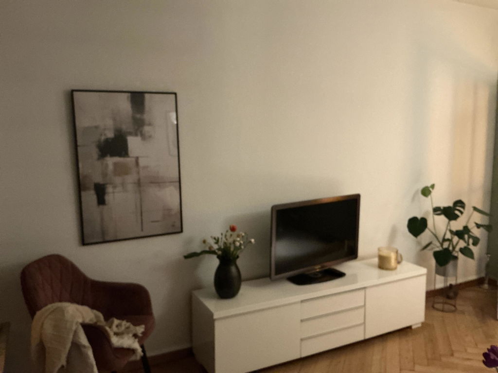
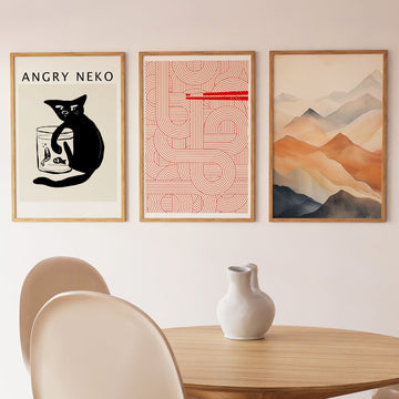
A grid abstraction in the line of De Stijl and Bauhaus geometry — rectangular fields and crossing lines, brought into a calm, monochrome register. The work reads as a composition rather than a statement: a study of how lines and blocks come into balance against generous open ground.
Soft graphite and pale stone meet over off-white, joined by clean vertical and horizontal lines. It is conceived asymmetrically: weight is built toward one side, then answered by the emptiness of the field. The palette stays within closely spaced neutrals so the composition can do the work.
At home in rooms whose architecture is already clear — a study, a hallway above a console, a dining room with a long table and a pendant light. It sits with oak shelving, brushed steel, matte plaster and undyed linen. It carries a long wall as the single work.
Printed on heavy matte fine-art paper, framed in solid oak or black ash behind shatter-resistant acrylic, or stretched as a satin cotto . . . Read More >>
A grid abstraction in the line of De Stijl and Bauhaus geometry — rectangular fields and crossing lines, brought into a calm, monochrome register. The work reads as a composition rather than a statement: a study of how lines and blocks come into balance against generous open ground.
Soft graphite and pale stone meet over off-white, joined by clean vertical and horizontal lines. It is conceived asymmetrically: weight is built toward one side, then answered by the emptiness of the field. The palette stays within closely spaced neutrals so the composition can do the work.
At home in rooms whose architecture is already clear — a study, a hallway above a console, a dining room with a long table and a pendant light. It sits with oak shelving, brushed steel, matte plaster and undyed linen. It carries a long wall as the single work.
Printed on heavy matte fine-art paper, framed in solid oak or black ash behind shatter-resistant acrylic, or stretched as a satin cotton canvas over a wooden frame. Each version arrives ready to hang.
Frequently asked questions
What style does Monochrome Elegance belong to?
A contemporary grid abstraction in the line of De Stijl and the Bauhaus — geometric blocks and crossing lines, refined to a monochrome Japandi palette. The composition is the subject; the colour is the quiet around it.
Why is the composition asymmetric?
The weight sits to one side and is answered by open ground on the other. The asymmetry is the discipline of the work — it stays visually balanced through proportion and weight, not mirroring.
Which rooms suit it?
Studies, hallways, dining rooms — anywhere the architecture and joinery already carry clear lines. It pairs especially well with white plaster, oak and brushed steel, and comes into its own as the single work on a wide wall.
Which formats are available?
Poster on heavy matte fine-art paper, framed print in oak or black ash behind shatter-resistant acrylic, or satin cotton canvas on a wooden stretcher. All printed to order in Europe with archival pigment inks.
<< Read Less
#Abstract
•
#Abstract Grid
•
#Abstract Minimalist
•
#Minimalist
•
#Modern