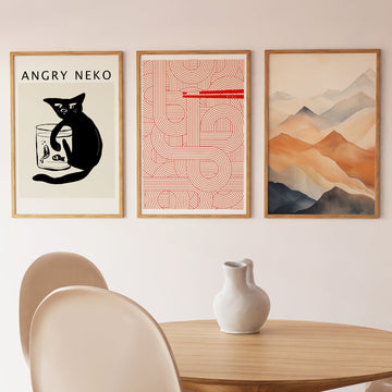
A line of mountains fades into mist. The peaks are pale and unhurried, stacked in soft layers that lighten as they recede, until the farthest ridge is barely more than a breath of grey against the sky. Below them, broad bands of colour drift like wind-shaped dunes — muted ochres, dust and stone, a quiet warmth held against cool atmosphere. There are no figures, no sharp edges. The subject is stillness itself: a landscape reduced to its calmest gestures.
The image is built in watercolour, where pigment is carried by water and allowed to settle. Tones bleed into one another in graded washes, a gentle bokashi-like transition that recalls East Asian ink-and-wash painting. Edges stay soft because the colour was laid wet and left to find its own boundary. The dune-coloured bands keep faint variation across their width, the trace of a brush moving slowly. Nothing is outlined; everything is suggested.
On a wall, the piece asks for little and gives a sense of space. Its . . . Read More >>
A line of mountains fades into mist. The peaks are pale and unhurried, stacked in soft layers that lighten as they recede, until the farthest ridge is barely more than a breath of grey against the sky. Below them, broad bands of colour drift like wind-shaped dunes — muted ochres, dust and stone, a quiet warmth held against cool atmosphere. There are no figures, no sharp edges. The subject is stillness itself: a landscape reduced to its calmest gestures.
The image is built in watercolour, where pigment is carried by water and allowed to settle. Tones bleed into one another in graded washes, a gentle bokashi-like transition that recalls East Asian ink-and-wash painting. Edges stay soft because the colour was laid wet and left to find its own boundary. The dune-coloured bands keep faint variation across their width, the trace of a brush moving slowly. Nothing is outlined; everything is suggested.
On a wall, the piece asks for little and gives a sense of space. Its low, even contrast and dusty palette settle into rooms built on natural materials — pale wood, linen, stone, unbleached cotton. It reads as calm above a bed, behind a reading chair, or along a hallway where the eye can rest on it in passing. In a japandi or minimalist interior it holds its place without raising its voice, a window onto distance rather than a focal point that demands attention.
Choose the format that suits the room. On fine art paper the matte surface holds the soft tonal gradations; framed behind shatter-resistant acrylic it gains depth and a clean edge; on satin-coated cotton canvas the bands settle into the weave for a warmer, textile feel.
Frequently asked questions
What does this poster show?
A range of misty mountains fading into the distance above broad, dune-like bands of muted colour. The scene is calm and atmospheric, with no figures and no hard detail — only soft layers of land and sky.
What technique was used to make it?
It is a watercolour image. The colour is laid wet so tones blend in graded washes, a soft bokashi-style gradation drawn from East Asian ink-and-wash tradition. Edges stay diffuse and the surface feels airy rather than sharp.
What is the colour palette?
Quiet and earthy: dust, ochre, sand and stone in the lower bands, cooling to pale greys and soft whites in the misted peaks. The contrast is low and the overall tone is warm but restrained.
Which rooms suit this print?
Spaces meant for rest. It works well in a bedroom, a reading corner, or a hallway, and pairs naturally with natural materials like pale wood, linen and stone in japandi and minimalist interiors.
<< Read Less
#Abstract
•
#Dune Wash
•
#Landscape
•
#Minimalist
•
#Minimalist Watercolor
•
#Modern
•
#Mountain
•
#Watercolor