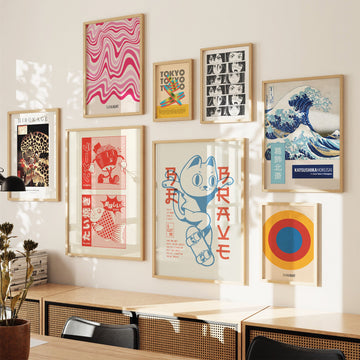
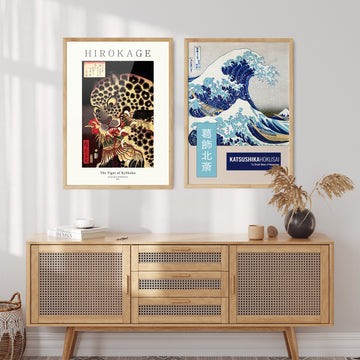
A sequence of oval forms, each densely filled with black ink and brushwork, stacks in rhythmic rows through this composition, each row offset slightly against the one above it, so that the surface develops a lateral movement — the formal logic of a wave caught at rest. The individual marks — bold, textured, alive with the slight irregularity of hand-applied ink — read together as a repeating pattern, but up close the variance of each stroke is visible: some dense and opaque, others with the lighter pull of a drier brush, each a distinct mark within the overall rhythm.
This contemporary studio work in the Japandi graphic tradition draws on the long history of wave depiction in Japanese design. The wave motif appears in Edo-period painting, in the formalised wave crests of traditional komon textile patterns, and in the dramatic compositions of Katsushika Hokusai. Here it is reduced to its essential form — the oval, repeated — and carried out with the direct energy of ink . . . Read More >>
A sequence of oval forms, each densely filled with black ink and brushwork, stacks in rhythmic rows through this composition, each row offset slightly against the one above it, so that the surface develops a lateral movement — the formal logic of a wave caught at rest. The individual marks — bold, textured, alive with the slight irregularity of hand-applied ink — read together as a repeating pattern, but up close the variance of each stroke is visible: some dense and opaque, others with the lighter pull of a drier brush, each a distinct mark within the overall rhythm.
This contemporary studio work in the Japandi graphic tradition draws on the long history of wave depiction in Japanese design. The wave motif appears in Edo-period painting, in the formalised wave crests of traditional komon textile patterns, and in the dramatic compositions of Katsushika Hokusai. Here it is reduced to its essential form — the oval, repeated — and carried out with the direct energy of ink on paper.
The composition is strong and directional. On a large wall in a living or dining room, it creates a presence legible from across the room; in a bedroom, the rhythmic repetition of the form works as a calming element. The black-and-neutral palette is versatile and harmonises well with natural plaster, light paint, or stone walls. The boldness of the marks means the work functions best with some breathing room.
Available as a fine art print on acid-free paper, as a framed print behind shatter-resistant acrylic glazing, or as satin-coated cotton canvas on a solid wooden frame, ready to hang.
Frequently asked questions
Which motif does this composition use?
The composition uses a recurring oval form to suggest waves — a motif with deep roots in Japanese visual culture, from Hokusai's compositions to the formalised wave patterns of traditional komon textiles. Here the form is reduced to its essential gesture: a bold, black, hand-brushed oval, repeated in rhythmic rows.
What makes this a Japandi work rather than a purely Japanese one?
Japandi joins the expressive directness of Japanese ink practice with the graphic restraint of Scandinavian design. In this work the wave motif is treated graphically — without colour or ornament — while the hand-applied brushwork keeps the energy and irregularity of the Japanese ink tradition.
What kind of room suits this work?
The composition has rhythm and weight. In a living or dining room it creates a strong presence from across the room; in a bedroom, the repetition of the wave form is calming. The black-and-neutral palette is versatile and fits both minimal and classic interiors.
Which sizes and formats are available?
Available in several standard sizes in three formats: fine art print, framed fine art print, and canvas print. All options are listed on the product page.
<< Read Less
#Abstract
•
#Abstract Minimalist
•
#Geometric
•
#Geometric Painterly Abstraction
•
#Minimal
•
#Minimalist