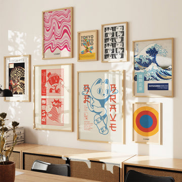
Harmony Flow is a geometric composition built on the interplay of straight and curved lines. Fine black lines — some fanning out, some parallel and horizontal — are drawn with the precision of a technical diagram on a warm cream ground. The visual effect is controlled tension: the composition feels static and animated at once, as if the lines were frozen mid-movement.
The print uses cleanly vector-drawn lines of even weight, with no tonal variation or brushwork. The discipline of the line spacing gives the work its character: where the spacing widens, the eye senses openness; where it narrows, density. The technique draws on architectural cross-section drawing and the meticulous line of Japanese karesansui garden-rake patterns.
Harmony Flow rewards placement in rooms where close viewing is possible — a reading chair, a desk, a bathroom wall. The cream-and-black palette is highly adaptable: clean and modern in a white-walled interior, warm and quiet in a room with . . . Read More >>
Harmony Flow is a geometric composition built on the interplay of straight and curved lines. Fine black lines — some fanning out, some parallel and horizontal — are drawn with the precision of a technical diagram on a warm cream ground. The visual effect is controlled tension: the composition feels static and animated at once, as if the lines were frozen mid-movement.
The print uses cleanly vector-drawn lines of even weight, with no tonal variation or brushwork. The discipline of the line spacing gives the work its character: where the spacing widens, the eye senses openness; where it narrows, density. The technique draws on architectural cross-section drawing and the meticulous line of Japanese karesansui garden-rake patterns.
Harmony Flow rewards placement in rooms where close viewing is possible — a reading chair, a desk, a bathroom wall. The cream-and-black palette is highly adaptable: clean and modern in a white-walled interior, warm and quiet in a room with clay or linen surfaces.
Available as an unframed paper poster in several standard formats, and as a framed print with shatter-resistant acrylic glass in a slim contemporary frame. The framed version arrives ready to hang.
Frequently asked questions
What visual effect does the line spacing have?
The measured intervals between the lines create a subtle optical rhythm — an almost wave-like effect as the eye glides across the composition. This connects to the Op Art tradition of the 1960s and the rake patterns of Zen stone gardens.
What is the colour palette?
Two-colour: black lines on a warm cream ground. The print is essentially monochromatic; its visual interest comes entirely from the line geometry.
Which rooms suit it?
Rooms with good natural light show the line work best — a living room, a study, a bathroom. The palette works equally well in cool-white and warm-toned interiors.
Is it also available framed?
Yes. The framed version has shatter-resistant acrylic glass in a slim contemporary frame and arrives ready to hang.
<< Read Less
#Abstract
•
#Geometric
•
#Geometric Minimalist
•
#Minimal
•
#Minimalist