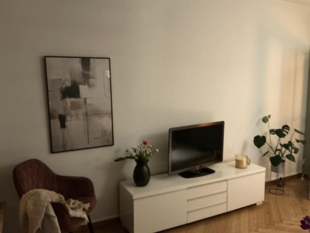
A deep navy holds the left edge of the composition, beside a heavy black mass and softer charcoal passages. Across the centre, ochre and warm gold strokes lay down short, broken lines; fine threads of black ink cross the field, dripping and ending in small punctuating drops. The cream ground holds everything together without flattening the variety of the marks.
The work draws on the line of mid-twentieth-century abstract expressionism — the gestural confidence of Kline, the colour weight of early Diebenkorn — and adapts that vocabulary into a Japandi register, where the composition is allowed to be rich but not overloaded. Oil-paint impasto, ink line, and dry-brushed pigment share the surface without competing.
The piece carries more colour than most Japandi work, and it settles well into rooms already kept warm — wood, brass, brown leather, terracotta. It reads strongest with breathing room on either side and pairs comfortably with a single complementary work, or . . . Read More >>
A deep navy holds the left edge of the composition, beside a heavy black mass and softer charcoal passages. Across the centre, ochre and warm gold strokes lay down short, broken lines; fine threads of black ink cross the field, dripping and ending in small punctuating drops. The cream ground holds everything together without flattening the variety of the marks.
The work draws on the line of mid-twentieth-century abstract expressionism — the gestural confidence of Kline, the colour weight of early Diebenkorn — and adapts that vocabulary into a Japandi register, where the composition is allowed to be rich but not overloaded. Oil-paint impasto, ink line, and dry-brushed pigment share the surface without competing.
The piece carries more colour than most Japandi work, and it settles well into rooms already kept warm — wood, brass, brown leather, terracotta. It reads strongest with breathing room on either side and pairs comfortably with a single complementary work, or stands alone as the warmest note in a room of cooler neutrals.
Available as a fine art print on acid-free paper, as a framed print behind shatter-resistant acrylic, or as a satin-coated cotton canvas, stretched over a solid wood frame and ready to hang. Each format is made to order.
Frequently asked questions
Which painting traditions does this artwork draw on?
It draws on mid-twentieth-century abstract expressionism — the gestural mark of Franz Kline, the colour weight of early Richard Diebenkorn — adapted into a Japandi-restrained composition that allows richness without overload.
Which colours appear in the composition?
Deep navy, dense black, charcoal grey, warm ochre, and a punctuating gold, all laid over a cream ground. Ochre and gold are the warm centre; navy and black anchor the left side.
Which interiors suit this print?
Rooms with warm materials — natural wood, brass, leather, terracotta, jute. The palette settles into spaces that already carry warmth, where it can act as a colour focus rather than competing against cooler decor.
What kinds of marks are visible in the print?
Several distinct kinds: heavy oil-paint impasto in the navy and black masses, dry-brushed ochre and gold passages, fine ink lines crossing the field, and small punctuating drops. All are preserved in the print.
<< Read Less
#Abstract
•
#Abstract Expressionism
•
#Complex Abstraction
•
#Expressionism
•
#Modern