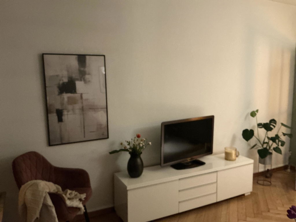
Abstract expressionism reduced to a calm, warm horizon — bands of ochre, amber and pale gold that read more like light than object. The composition follows the postwar painters who made colour itself the subject, softening that gesture with contemporary Japandi calm.
Layered brushstrokes build a horizontal field of warm tones, each layer letting the one beneath show through. The transitions are deliberately gentle — no hard line, no fixed focus — so the eye wanders across the surface as it would glide over a sun-warmed wall in evening light.
Warm and unbound, the motif finds its place in rooms already kept neutral — a linen sofa, oak shelving, a hand-thrown bowl. Hang it above a low console, at the foot of the bed, in a reading corner where the rest of the wall stays clear. It suits raw textures: ash wood, undyed wool, paper lamps.
Printed on museum-quality matte paper, framed in solid oak or black ash behind splinter-resistant acrylic glazing, or stretched . . . Read More >>
Abstract expressionism reduced to a calm, warm horizon — bands of ochre, amber and pale gold that read more like light than object. The composition follows the postwar painters who made colour itself the subject, softening that gesture with contemporary Japandi calm.
Layered brushstrokes build a horizontal field of warm tones, each layer letting the one beneath show through. The transitions are deliberately gentle — no hard line, no fixed focus — so the eye wanders across the surface as it would glide over a sun-warmed wall in evening light.
Warm and unbound, the motif finds its place in rooms already kept neutral — a linen sofa, oak shelving, a hand-thrown bowl. Hang it above a low console, at the foot of the bed, in a reading corner where the rest of the wall stays clear. It suits raw textures: ash wood, undyed wool, paper lamps.
Printed on museum-quality matte paper, framed in solid oak or black ash behind splinter-resistant acrylic glazing, or stretched as satin cotton canvas on a wooden frame. Each version arrives ready to hang.
Frequently asked questions
Which style does Golden Flux belong to?
A calm current of contemporary abstract expressionism — color-field painting in the tradition of Mark Rothko and Helen Frankenthaler, pulled back to a warm, neutral palette that suits Japandi interiors.
Which rooms suit a warm-toned abstract like this?
Rooms with natural light — living rooms, bedrooms, reading corners. The amber tones warm cool surfaces (concrete, stone, white walls) and give neutral palettes depth without competing with them.
Which colours go best with Golden Flux?
Off-white, oat, soft grey and undyed linen. Mid-tone woods (oak, ash) strengthen the amber; black accents in hardware or joinery sharpen the warmth without making the room feel heavy.
Is the work available as a poster, framed print or canvas?
In all three formats. Each version uses archival pigment inks and is made to order in Europe: matte fine-art paper, a frame in oak or black ash behind splinter-resistant acrylic glazing, or satin cotton canvas on a wooden frame.
<< Read Less
#Abstract
•
#Abstract Expressionism
•
#Expressionism