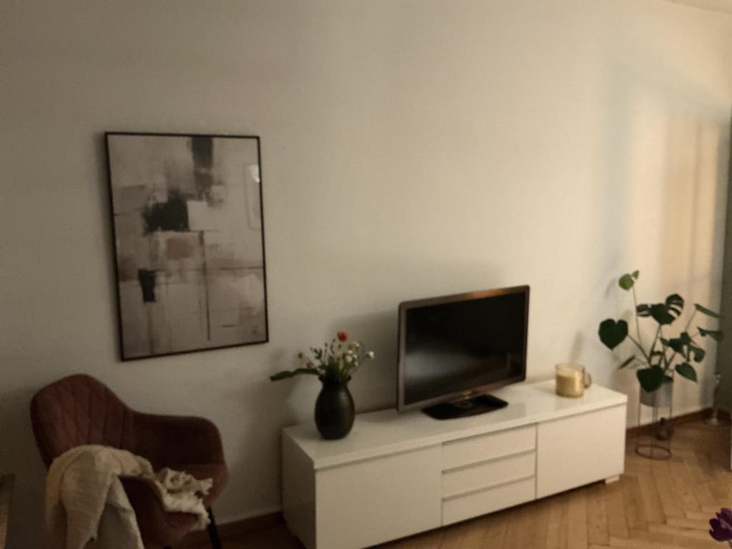
Geometric Harmony arranges three overlapping circles — coral, sage green and deep charcoal — in quiet tension at the centre of the composition. The light surface texture of each form gives the geometry a tactile quality, softening the hard edge of the circle into something more considered. The interplay between warm and cool tones, and the way the overlapping areas read differently from the surrounding fields, is the whole subject of the work.
The composition draws on the visual language of mid-century geometric abstraction, where form and colour relationships carry the full weight of meaning, and on the wabi-sabi principle that balance need not be symmetrical or free of imperfection. The palette is muted rather than saturated: the energy is held back, closer to contemplation than statement. Three forms, three colours, the spaces between them.
In the living room it holds its own as a single piece on a light wall. In the study it anchors a gallery arrangement. The . . . Read More >>
Geometric Harmony arranges three overlapping circles — coral, sage green and deep charcoal — in quiet tension at the centre of the composition. The light surface texture of each form gives the geometry a tactile quality, softening the hard edge of the circle into something more considered. The interplay between warm and cool tones, and the way the overlapping areas read differently from the surrounding fields, is the whole subject of the work.
The composition draws on the visual language of mid-century geometric abstraction, where form and colour relationships carry the full weight of meaning, and on the wabi-sabi principle that balance need not be symmetrical or free of imperfection. The palette is muted rather than saturated: the energy is held back, closer to contemplation than statement. Three forms, three colours, the spaces between them.
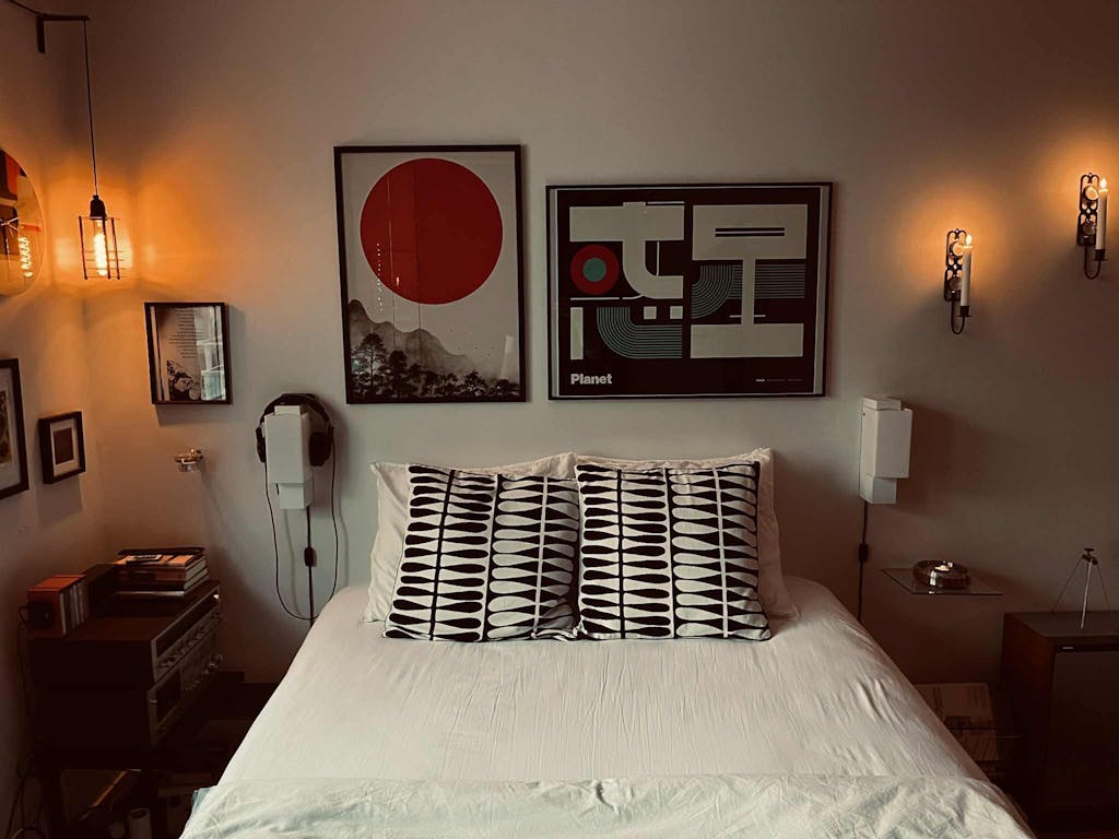
In the living room it holds its own as a single piece on a light wall. In the study it anchors a gallery arrangement. The muted coral reads warm against cool linen; the charcoal holds its place beside natural wood furniture.
Available as a fine-art paper print, as a framed print with splinter-free acrylic glazing, or on satin cotton canvas. Made to order.
Frequently asked questions
Which three colours does Geometric Harmony use, and what mood do they create?
Muted coral, sage green and deep charcoal. Together they balance warm and cool tones without harsh contrast, creating a held-back, meditative quality.
Which art tradition does this composition draw on?
Mid-century geometric abstraction, where pure form and colour carry the full meaning. The surface texture also references the wabi-sabi aesthetic, which values imperfection and the trace of the hand.
Which rooms suit Geometric Harmony?
Spaces with natural wood, stone or linen. Calming in a bedroom or study, structuring in living spaces. It suits Japandi and Scandinavian interiors.
Does the texture differ by print format?
On fine-art paper the texture has high detail with clear tonal separation. On satin canvas the weave adds an extra physical dimension. Both formats use archival inks.
<< Read Less
#Abstract
•
#Abstract Illustration
•
#Geometric
•
#Geometric Minimalist
•
#Illustration
•
#Minimal
•
#Minimalist
•
#Modern
•
#Textured