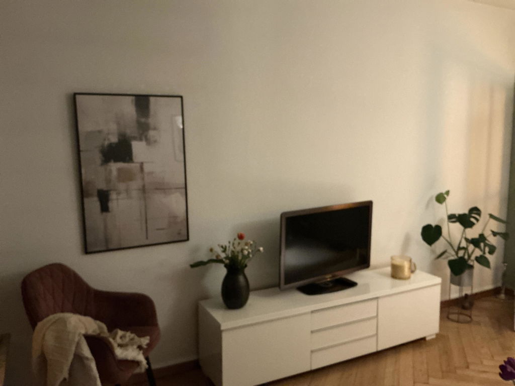
Three distinct marks hold a quiet dialogue across this cream-coloured composition. A broad, warm beige brushstroke in the upper area suggests settling light, or the weight of something unseen just above the picture frame. Below it, a dark grey watercolour circle is painted in a single pass of the brush — full but not perfect, with the slight irregularity of a hand-led gesture. Crossing both is a strong black arc that connects the upper and lower elements with a gesture at once architectural and free. The composition draws on the Japanese tradition of considered arrangement: each element placed in awareness of the others, the spaces between treated as content.
This contemporary studio work, in the Japandi minimalist tradition, combines the material vocabulary of ink and watercolour with the graphic restraint of Scandinavian design. Printed on heavy matte fine-art paper, all three elements keep their individual character — the warmth of the beige, the depth of the grey ci . . . Read More >>
Three distinct marks hold a quiet dialogue across this cream-coloured composition. A broad, warm beige brushstroke in the upper area suggests settling light, or the weight of something unseen just above the picture frame. Below it, a dark grey watercolour circle is painted in a single pass of the brush — full but not perfect, with the slight irregularity of a hand-led gesture. Crossing both is a strong black arc that connects the upper and lower elements with a gesture at once architectural and free. The composition draws on the Japanese tradition of considered arrangement: each element placed in awareness of the others, the spaces between treated as content.
This contemporary studio work, in the Japandi minimalist tradition, combines the material vocabulary of ink and watercolour with the graphic restraint of Scandinavian design. Printed on heavy matte fine-art paper, all three elements keep their individual character — the warmth of the beige, the depth of the grey circle, the weight of the black line — at every format scale.
Because the three marks pull in different directions — beige above, grey below, arc crossing — the composition holds attention differently depending on where it hangs. Above a desk or reading chair, where you sit close to it, the dialogue between the elements is the subject. Seen from across the room, it resolves into a balanced abstract form. Both readings are available at once.
Available as a print on heavy matte fine-art paper, as a framed print behind shatter-resistant acrylic, or as a satin cotton canvas on a solid wooden frame, ready to hang.
Frequently asked questions
What do the three elements in this composition show?
The composition shows a warm beige brushstroke in the upper field, a dark grey watercolour circle in the lower middle, and a strong black arc crossing both. The three elements hold a visual dialogue — each independent, each in relation to the others.
Which visual tradition does this work draw on?
The work draws on the East Asian tradition of arranged ink composition — the practice of placing a small number of marks in deliberate relation to negative space. The restraint of the palette also reflects the Japandi design sensibility.
Does the circle in this composition carry a symbolic meaning?
In Japanese visual culture the circular form — ensō in the Zen tradition — carries connotations of wholeness, completeness, and the empty space from which things arise. Here the grey circle is used primarily as a compositional element, though that symbolic weight remains available in the reading.
Which formats are available?
Available in several standard sizes across three formats: fine-art print, framed fine-art print, and canvas print. All options are listed on the product page.
<< Read Less
#Abstract
•
#Abstract Minimalist
•
#Minimalist
•
#Mixed-Media Minimal Abstraction