Alabaster Currents stands in the tradition of impasto painting that took shape in mid-twentieth-century abstract art, when thick, sculptural paint became the subject in its own right. The work follows the line of Abstract Expressionism, using palette-knife strokes to freeze movement at the surface — currents of pale cream and chalk white that circle an invisible centre. The image reads as calm rather than dramatic, closer to the meditative side of the movement.
The motif is built up in several layers of off-white, applied with palette knife and broad brush. Light catches in the ridges where the paint thickens and sinks into the shallow troughs between strokes. The colour stays within a narrow alabaster range, so that texture — not palette — carries the rhythm.
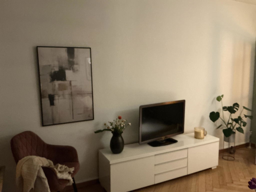
On the wall, the work quiets the room. It works well above a low sideboard or behind a reading chair, where its near-monochrome surface takes up the warmth or coolness of the light across the day. In a Japan . . . Read More >>
Alabaster Currents stands in the tradition of impasto painting that took shape in mid-twentieth-century abstract art, when thick, sculptural paint became the subject in its own right. The work follows the line of Abstract Expressionism, using palette-knife strokes to freeze movement at the surface — currents of pale cream and chalk white that circle an invisible centre. The image reads as calm rather than dramatic, closer to the meditative side of the movement.
The motif is built up in several layers of off-white, applied with palette knife and broad brush. Light catches in the ridges where the paint thickens and sinks into the shallow troughs between strokes. The colour stays within a narrow alabaster range, so that texture — not palette — carries the rhythm.
On the wall, the work quiets the room. It works well above a low sideboard or behind a reading chair, where its near-monochrome surface takes up the warmth or coolness of the light across the day. In a Japandi or warm-minimalist interior, it serves as a quiet anchor and leaves room for linen, wood and stoneware.
Printed on heavy matte fine-art paper. Available framed behind shatter-resistant acrylic or as satin-coated cotton canvas, stretched and ready to hang on the wall.
Frequently asked questions
Which art tradition does Alabaster Currents belong to?
It stands in the tradition of impasto painting and Abstract Expressionism — a contemporary studio work in that line, not a historical original.
Is the textured surface actually three-dimensional?
The original is built up with palette-knife paint. The print reproduces that relief faithfully through high-resolution scanning and matte pigment inks, though the printed surface itself is flat.
Which colours dominate the print?
Alabaster, chalk white and pale cream — a near-monochrome range that captures light rather than colour.
Which interior styles suit the print best?
Japandi, Scandinavian minimalism and warm-neutral interiors. It sits naturally alongside oak, linen and unglazed ceramic.
<< Read Less
#Abstract
•
#Abstract Expressionism
•
#Expressionism
•
#Impasto Technique
•
#Modern
•
#Texture
•
#Textured Abstract