Three forms of the same image will live differently on a wall. A loose sheet of paper, a paper print sealed behind an acrylic panel in a wooden frame, and a satin-finish canvas stretched over a wooden bar — each one carries the artwork in its own register, and each one suits a different room, a different artwork, and a different way of living with it.
This guide is for the moment before you order. Not a treatise — we'll keep it to the practical questions: what each form does well, where each one falls short, and how to match it to the work you've fallen for, whether it's an Edo-period woodblock or a contemporary scandi-minimal landscape.
The three forms, in plain language
Art Print (paper). A flat, museum-grade fine art paper print. No frame, no cover. You receive a single sheet, ready for the frame of your choice — or no frame at all, if you prefer the casual, taped-up-on-the-wall look that runs through Japanese studio interiors and Kinfolk magazine spreads.
Framed Print. The same fine art paper, mounted behind a lightweight, shatter-resistant acrylic panel — not glass — inside a solid wooden frame (oak, black, white) and shipped ready to hang. The acrylic is lighter than glass, won't shatter in transit, and reflects noticeably less than ordinary glass, though it isn't fully anti-reflective.
Canvas Print. The image printed directly onto 370 g/m² 100% cotton satin-coated artistic canvas, stretched over a wooden bar and shipped ready to hang. No cover panel. After printing, the satin coating reads as a soft sheen, not matte and not glossy — a finish closer to a fine-art photographic print than to a raw cloth. The cotton weave is pronounced and decorative, and it's the surface most museums use when reproducing full-colour graphics and art photography.
Decision at a glance
| Question | Paper Art Print | Framed Print (acrylic) | Canvas Print (satin) |
|---|---|---|---|
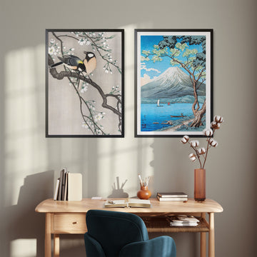
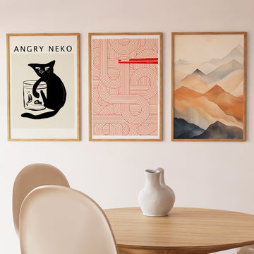
| Looks best with | minimal monochrome ink work, sumi-e, line drawings, modern geometric, minimalist typography | narrative ukiyo-e, detailed woodblock, modern geometric and minimalist circles where crisp edges matter | atmospheric shin-hanga landscapes, scandi misty landscapes, watercolor-style modern work, saturated abstracts |
| Lowest price tier | from €10.80 | from €38.80 | from €69.80 |
| Ready to hang | no — frame separately | yes | yes |
| Surface reflection | depends on your frame | acrylic reflects, but noticeably less than plain glass | soft satin sheen — no hard hotspots, but not fully matte |
| Shatter / breakage risk in transit | no surface to break | acrylic won't shatter — safer to ship and hang | no cover panel to break |
| Suits humid rooms (bathroom, kitchen) | only with proper framing | acrylic resists condensation better than glass | yes — no panel at all |
| Renter-friendly | yes — ships rolled in a tube | lighter than glass-framed equivalents | light and flat to handle |
| Holds up at XL size (70×100) | yes, if framed properly | yes — acrylic keeps the weight reasonable | yes — large canvas reads as a single object |
| The Kinfolk shelf-lean look | yes | sometimes | rarely |
Read the matrix as a soft sorting rule. None of these are wrong. It's a question of what fits.
Art Print on paper — when it works
Paper is the form woodblock prints were made in. There's a quiet honesty to a clean sheet of fine art paper held against the wall — it's how a curator in Kyoto would show you an Edo-period print, and it's how a designer in Copenhagen frames a Saturday morning.
It works particularly well for work where the surface is part of the meaning.
For classical Japanese art, that means ink-driven pieces: Matsumoto Hoji's The Toad — Monochrome, painted in 1814 as a single, almost careless ink gesture in the sumi-e tradition, doesn't ask for a glass or acrylic barrier. The unmediated paper is its element.
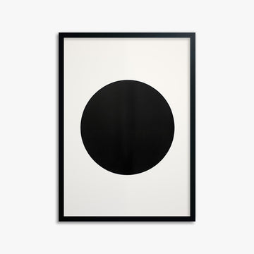
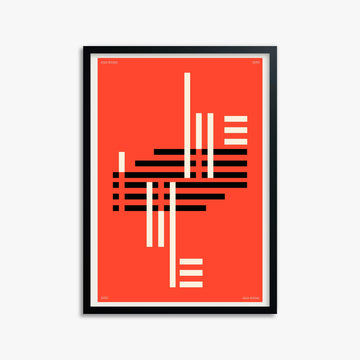
For modern work, paper is the natural home for geometric and minimalist pieces where edge precision matters — a black circle, a clean horizon band, a typographic poster. Eclipse Essence, a perfect black circle on cream, is the kind of image where any added texture (a heavy cloth weave, an unwanted reflection) would interrupt the gesture. Paper keeps the geometry honest.
The trade-off is small: paper alone needs a frame eventually if you want longevity, and it asks you to think about which frame. We've written a picture frame guide that covers oak, black, and white options, and how each one shifts the temperature of the image.
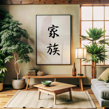
Best for: sumi-e and ink work, line drawings, modern geometric and minimalist pieces, typographic work, calligraphic pieces, anything where negative space or edge precision is doing the work. Also: renters, frequent movers, anyone who prefers to choose their own framing later.
Framed Print — when it works
A framed print is the version you don't have to think about twice. It arrives, you hang it, it's done.
Two things to know about the frame itself. First: the protective panel in front of the paper is acrylic, not glass. It's lighter, doesn't shatter, and reflects less than ordinary window glass — though it's not fully anti-reflective the way museum specialist glass can be. Second: the frame is solid wood (oak, black, or white) — not the printed-veneer particleboard you'd find at a mass retailer. The full breakdown is in the frame guide.
This is the form we'd recommend for detailed, narrative work where you want to lean in and read the linework.
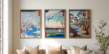
For classical art, that's prime ukiyo-e territory. Utagawa Hirokage's The Tiger of Ryōkoku from 1859 is a good example: a tiger and a rooster mid-confrontation, full of small gestures that benefit from the visual containment a frame gives.
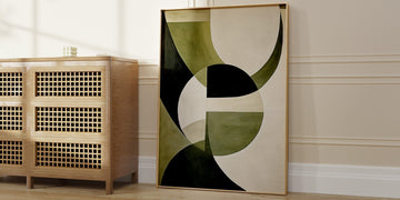
For modern work, framed paper is also the answer when geometric precision matters and you want a finished gallery look. A clean modern geometric piece — circles, horizon bands, sharp typography — reads strongest with the crispness paper holds and a frame's quiet containment, away from the cotton weave that canvas brings to the surface.
A practical note on reflection. The acrylic panel reflects less than plain glass, but it still reflects. In rooms with strong direct sunlight or a window opposite the wall, this can be a soft problem. The fix is either a wall the sun doesn't hit directly, or — if you want to be more careful — a canvas-finish edition instead.
Best for: ukiyo-e and shin-hanga at small-to-medium sizes (XS through M), modern geometric and minimalist pieces, gallery-wall arrangements, gifts, situations where you want a finished look out of the box.
Canvas Print — when it works
Canvas reads as warmer than paper. The 100% cotton substrate carries the image with a presence closer to a painting than to a print. The satin coating after printing gives a soft, even sheen — no hard hotspots like acrylic, but not the flat dryness of true matte. Colors stay saturated; the cotton weave stays visible and decorative.
It works especially well for atmospheric, painterly, and color-driven work — pieces where light, weather, gradient, or mood is the subject.
For classical art, shin-hanga landscapes are an obvious fit. Takahashi Hiroaki Shōtei's Mount Fuji from Lake Yamanaka, with its cherry blossom shoreline and Fuji-in-mist, lives more comfortably on cotton than under acrylic — the satin surface holds the gradient depth without imposing a hard reflective layer.
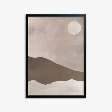
For modern work, canvas is the natural home for scandi-minimal landscapes, misty horizons, watercolor-style pieces, and anything where the colors should feel rich rather than printed-flat. Mesa Dawn, a minimalist desert landscape with mountains, takes the satin canvas surface as a natural extension of its atmospheric palette — the weave deepens the warmth rather than working against it.
Canvas is also the form to consider for large scale. At XL (70×100 cm), a framed piece with acrylic and a wooden moulding gets bulky and heavy. A stretched canvas at the same size is lighter, easier to handle, and reads as a single object on the wall rather than a paper enclosed in a frame.
One caveat: canvas exaggerates the texture of whatever's already in the image. Crisp linework, sharp typographic work, and pure geometric pieces — Eclipse Essence's perfect black circle, a clean two-band horizon, a square monochrome — can lose a touch of precision against the visible cotton weave. If edges and geometry matter, paper or framed paper is the better call. Canvas is for color, mood, and atmosphere.
Best for: shin-hanga and atmospheric classical landscapes, scandi-minimal modern landscapes, watercolor-style pieces, saturated modern abstracts, large formats (L and XL), humid rooms, walls with strong directional lighting where reflection would be a problem.
What about modern Japandi pieces specifically?
A short note, because we sell as many modern pieces as we do classical ones. The format-to-art-style logic is the same in both eras:
- Modern monochrome line work / minimalist ink-style → paper, framed later if desired
- Modern geometric / circles / sharp typography / clean color blocks → framed paper (acrylic keeps edges sharp)
- Scandi misty landscapes / watercolor-style / atmospheric modern abstracts → canvas
- Modern reimaginings of Edo-period work (e.g., the streetart-style Hoji Toad versions) → paper or framed paper at small/medium sizes; canvas works at L+ if the version leans painterly
The form follows the image, not the era.
Side-by-side: the practical questions
The room. Bathrooms and kitchens favor canvas (no acrylic panel to fog, no condensation at the seal). Living rooms with controlled light work for any of the three. Bedrooms with a window opposite the bed often suffer with framed acrylic — canvas or unframed paper is kinder.
The light. Direct, low-angle sunlight is the harder case. The acrylic panel reflects less than glass, but it still reflects. If the wall gets late-afternoon sun, lean toward canvas, or place the framed piece on an adjacent wall.
The wall. Plaster and drywall hold anything. Thin partition walls and rented apartments handle our framed prints comfortably because the acrylic panel is lighter than glass — at XL, the difference adds up.
The artwork itself. Trust what the image needs. Ink, line, geometry, sharp edges → paper, framed or unframed. Color, light, weather, mood, painterly gradient → canvas. This rule holds whether the artist worked in Edo Japan or last year in Stockholm.
The lifespan. All three use archival-grade materials. Behind the acrylic panel, paper is the most protected from dust and humidity. Canvas resists fading well but can collect surface dust over decades. Unframed paper depends entirely on the frame you eventually choose.
Shipping and handling. Paper rolls into a tube and survives most things. Framed prints with acrylic ship flat and arrive without the shatter risk a glass-framed piece would carry. Canvas ships flat, light, and is the least likely to suffer transit damage.
How to choose for your space
A short rule of thumb: match the form to the artwork, then sanity-check against the room.
- Line, ink, geometric, typographic, minimalist precision → paper, framed later if you want
- Detailed narrative work, gallery-finish, gift → framed print (acrylic, not glass)
- Atmospheric landscape, painterly color, scandi-minimal or shin-hanga mood → canvas
- Humid room or harsh light → canvas regardless of artwork
- XL scale → canvas for lightness, or framed print if the artwork is line-driven
For size, the interactive size guide does the visual maths better than words can. It previews each format on a wall at your own ceiling height.
If you're still unsure, the most useful question to ask is: do I want this to read as a print, or as a picture? Paper and framed paper read as prints. Canvas reads as a picture. Both are right answers — they're just different answers.
Frequently asked questions
Is the frame's panel real glass?
No. We use a lightweight, shatter-resistant acrylic panel — not glass. It's lighter to ship and hang, won't break in transit, and reflects less than ordinary window glass, though it isn't fully anti-reflective.
Is your canvas matte?
No. It's a 370 g/m² 100% cotton artistic canvas with a satin coating. After printing, the surface reads as a soft satin sheen — not glossy and not matte. The cotton weave stays visible as a decorative feature.
Is a canvas print better quality than a paper print?
No — different, not better. Both materials are archival. The right choice depends on the artwork and the room, not on which one is "better." Geometric and line-driven work suits paper; atmospheric and painterly work suits canvas.
Can I get the same artwork in all three forms?
Yes — most of the Japandi.art catalogue is available as paper Art Print, Framed Print, and Canvas Print. The form is a size-and-finish option on each product page.
Will a framed print show reflections on the acrylic?
Acrylic reflects, but noticeably less than ordinary glass. On most walls in normal indoor light this is a non-issue. On walls facing a window or under strong overhead spotlights, consider switching to canvas, which has no reflective cover at all.
Which option is the heaviest to hang?
Framed prints with the wood frame and acrylic panel are the heaviest of the ready-to-hang options, but lighter than equivalent glass-framed pieces. Canvas is the lightest. Paper alone weighs almost nothing.
Which is the best gift?
Framed prints are the most gift-friendly — they arrive finished, no extra step required, and the acrylic panel survives the unboxing without risk. Canvas works similarly. Paper rolls are a beautiful gift if the recipient already has a framer or a clear plan.
Do canvas prints fade in sunlight?
Our canvas prints use pigment-based inks rated for indoor display longevity. As with any artwork, avoid hanging in direct, sustained sunlight if you want maximum life. This applies equally to paper and framed prints.
The longer answer to "which one should I order?" is usually the same as the answer to "which one would the artwork rather be?" — and most of the time, the image itself will tell you. If you'd like a second opinion on a specific piece, the Japandi.art blog covers more of these decisions over time.
— Japandi.art